A well-thought logo design can build a positive image in people’s minds, whether they are your customers or not. Brand image is an important thing that can be supported by good business logo design. When customers think about your business, there must be a lot of thoughts that are processed in their minds. Marketers know how to craft these thoughts and emotions in their favor through a well-executed message and logo design.
A professional logo design should convey the purpose of your business. It should be simple, catchy, and easy to remember by the audience. It must create the impression that the audience can differentiate you from other brands.
Table of Contents
Types of Logo Design
There are various types of logos but do you know that there are five main categories of logos used to create an up-to-mark logo for your business?
Those five essentials are Lettermarks, emblems, wordmarks, brand marks, and combination marks.
Let’s discuss each of them in detail:
Lettermark
It is also acknowledged as a monogram logo. A lettermark logo design is made by letter or text, but it is based on the initials of the enterprise or brand instead of the brand’s full name. Some of the popular examples are Home Box Office (HBO), Procter & Gamble (P&G), Cable News Network (CNN), the National Aeronautics and Space Administration (NASA), Kentucky Fried Chicken (KFC), and Electronic Arts (EA).
This lettermark logo is a nice choice when you know it would be hard for people to remember the brand’s full name or have difficulty pronouncing it. Sometimes, brands choose this form of logo because it would be hard to custom design a logo for a long name in most of the media. So, it would be easy to shrink down the name and help the audience memorize it.
Wordmark
It is also acknowledged as a logotype, and it is the simplest kind of logo design. It casts the enterprise’s name alone in the text. It might be placed as signatures, handwriting, custom fonts, etc.
Some popular examples are Disney, Canon, Visa, Sony, Coca-Cola, Google, etc.
For large brands, simple and elegant type logos can display a sense of stability, confidence, and history to make that brand look powerful and fearless. Although, a wordmark logo design can be a good selection for startups, as it incorporates the brand’s full name and helps to make it punched into the audience’s mind.
Brandmark
It is also acknowledged as a pictorial mark. This logo design contains zero text but expresses itself with an eye-catching image, symbol, or icon representing the business or brand.
Some popular examples are Apple, Target bullseye, Red Cross symbol, Silhouette, Nike’s Swoosh, WWF Panda, etc.
If you want to make a psychological connection with your audience, then brandmark will work greatly to deepen the roots of your brand in your audience’s mind and create a more impulsive level to an image than the text in written form, which needs to be interpreted.
For example, on social media, where Snapchat ghost, Twitter bird, and Instagram camera these icons inspire people to share the content they see on a website without second thoughts.
Read More! History Behind Ghost Face Snap Chat Logo
Combination Mark
As we can get the idea by the name of this category, a combination mark consists of a mixture of wordmark and symbol. Some popular examples are Doritos, Pizza Hut, Xbox, Adidas, Walmart, Microsoft, etc.
It is also acknowledged as logotypes. You can convey a visual representation of what your brand offers.
Emblem
Same as a combination mark, an emblem also includes both symbols and texts, but if we talk about the emblem, then the text appears inside the icon or symbol or the logo.
Some popular examples are Harley-Davidson, MasterCard, NFL, Starbucks, Burger King, etc.
There are many things that we consider for an intellectual logo, one of them is the color scheme that we need to take care of while planning a customizable logo:
Color Scheme for A Custom Design Logo
Whether you are focusing on building trust, playfulness, or positivity, color plays a vital role in creating that brand image. Some prominent colors are being used in preparing logo design coupons which are as follows with real-life brand examples:
Red
Red color is one of the primary colors. It is a universal symbol of excitement, energy, youthfulness, boldness, strength, and Intense behavior of the brand.
Example: Puma, Nintendo, Youtube, ESPN, Target.

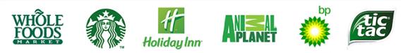
Green
The green color promises a sense of restfulness, balance, calmness, and connection to nature. It doesn’t have that kick of energy as warm colors do, but it has that sense of security, growth, wealth, peacefulness, and freshness to relax the mind.
Examples: Starbucks, Animal Planet, Whole Foods, TicTac, Holiday Inn, etc.
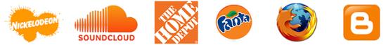
Orange
The orange color extracts the feeling of happiness and vitality. It presents a call to action for friendliness, affordability, confidence, energy, and cheerfulness.
Examples: The Home Depot, Nickelodeon, Fanta, Miranda, Mozilla Firefox, Soundcloud, and so on.
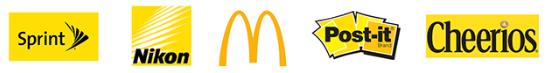
Yellow
Brands that are trying to draw their customers with a warm, comforting, cautious, and positive nature should opt for yellow color. Moreover, the yellow color can radiate a playful, clear, and optimistic identity of the brand.
Examples: Bumble, Post-it, National Geographic, McDonald’s, Honey Boo, Cheerios, etc.
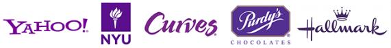
Purple
Brands that want to portray a sense of royalty, luxury, calmness, and sophistication then they should opt for purple color. It is also the best choice for those who want to display the creative, wise, and imaginative behavior of the brand.
Examples: Milka, Yahoo, Sanitarium, Curves, Benq, Jackey Jones, etc.
Blue
Blue indicates a sense of spiritual awareness, security, and wisdom with the feeling of trust. Medical and healthcare centers are encouraged if they incorporate this color with their brand. Moreover, a deeper blue indicates the corporate brands that show professionalism, dependability, and strength.
Examples: Samsung, Dell, Jetpack, Paypal, Ford, etc.
Quick Tips & Tricks To Make Customizable Logo Catchy
Shapes – Think Outside The Box
Use shapes to make the logo look professional; for example: use a square box and put the brand name inside it; this way, it will look more neat and professional.
Use Empty Spaces
Don’t stuff your logo that will look so messy. Try to use the spaces and make your logo look clean, like put your compact logo in the center and leave the other sides empty so your logo will be prominent and worthy too.
Read More! Design Hill Coupon Build your Brand with #1 Design Company
Pictorial Presentation
A picture speaks a thousand words. A logo design can visually display what you do or what your business is about. Use icons or symbols to be more expressive and engaging simultaneously.
Conclusion
An impressive logo will become a status symbol for those who carry it, like bags, shoes, clothes, etc., and creates brand loyalty. Logos are the most influential marketing tool if used correctly to build your brand image. It deals as a signature for the ownership of the brand and protects against imitations and forgeries.